An electric guitar line from a company known for acoustics. It had to earn credibility with electric players who had no reason to take it seriously, and it could not simply inherit the parent brand's visual language without inheriting its associations.
Go gritty and loose rather than clean and premium. Filmic grain, moody light, and references drawn from car and surf culture rather than from guitar photography. The look had to feel like it came from the scene the instrument belongs to, not from a catalog.
Andy Powers built the first of these himself, and I was in the room for it. [One or two lines: what you saw being made, and the specific thing it told you about how the brand should look. This is the bridge between the workshop and the campaign, so name it.]
[One or two lines on what the film had to carry: who it was speaking to, what it had to prove, and how the grit was built in camera.]
Directed and executed the visual identity from launch: campaign photography, the launch film, artist collaborations, and the e-commerce photography system that the configurator runs on.
The frame above is the campaign register: available light, a room, a guitar leaning where someone left it. This is the opposite discipline. Every finish is shot from the same camera position under the same light, so any colour can be swapped in place without the frame moving. That repeatability is what lets the configurator on the live site work at all. Horizontal registration holds to 2.5px across the set.
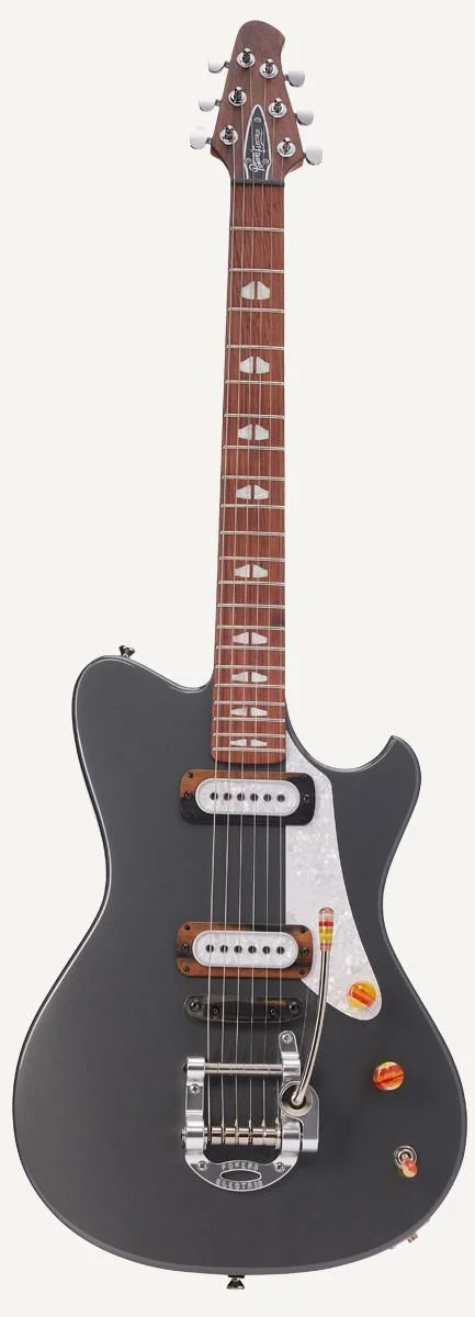
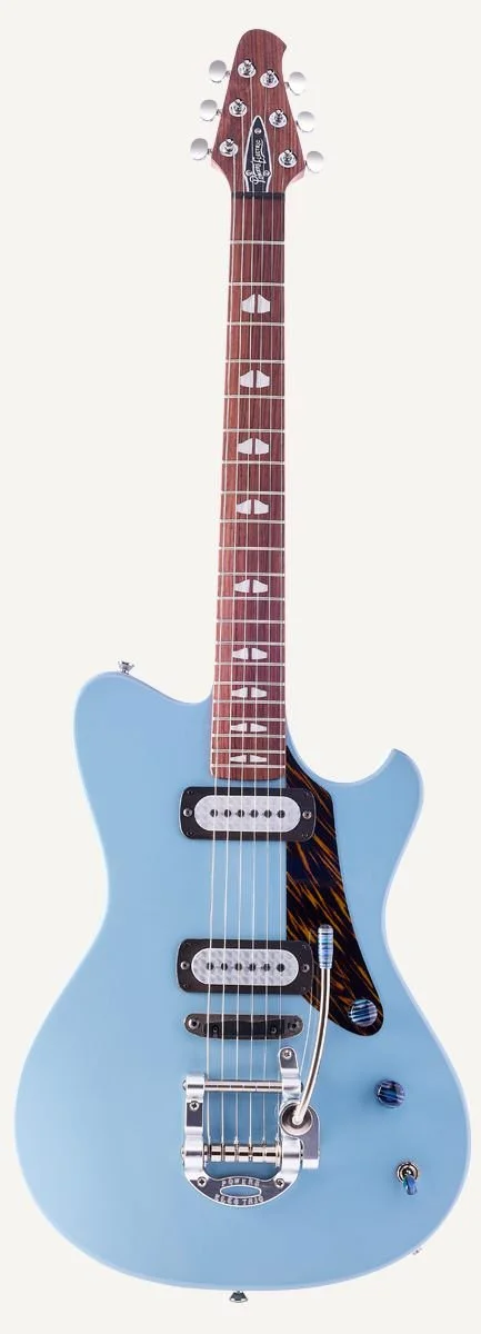
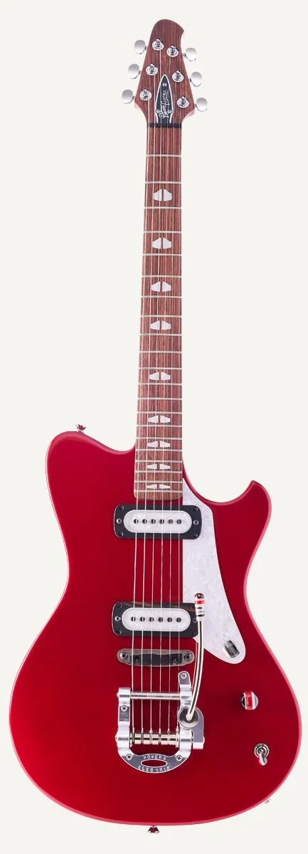
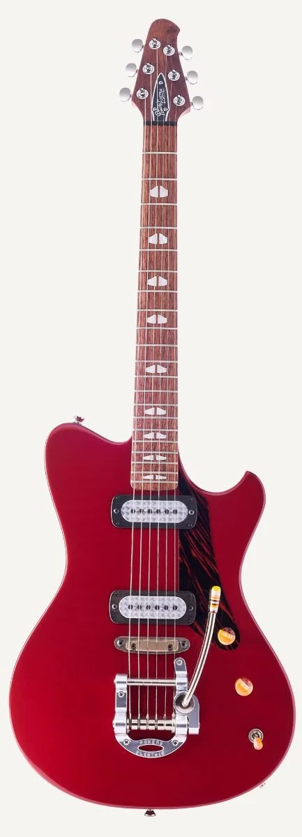
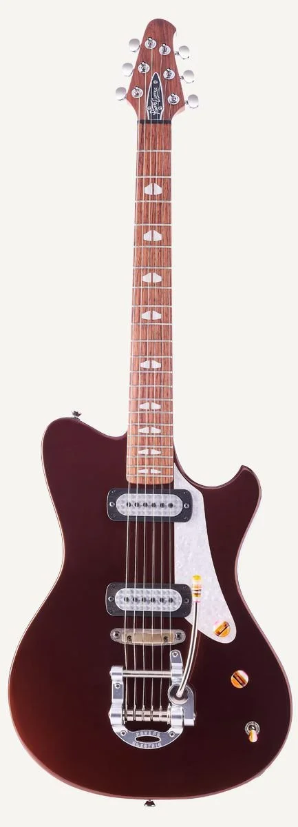
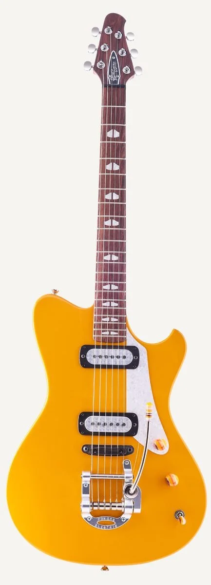
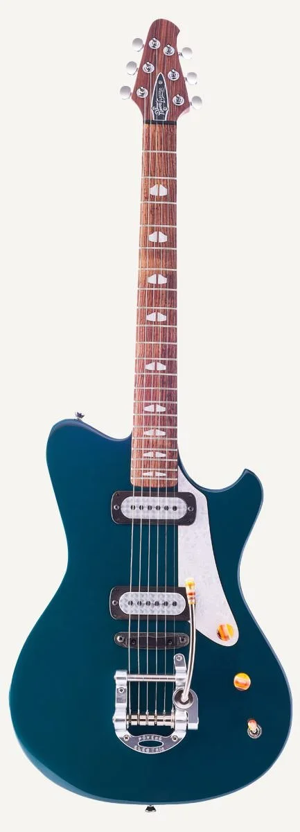
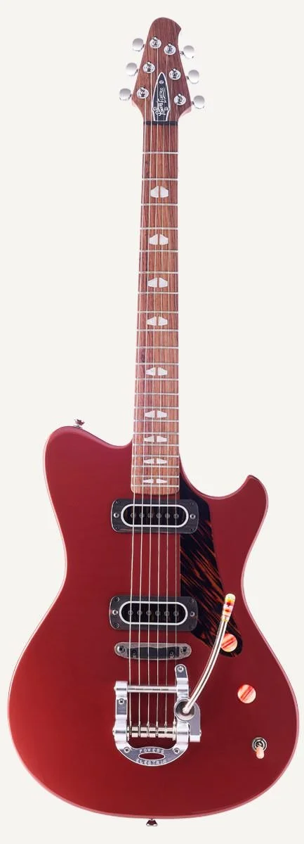
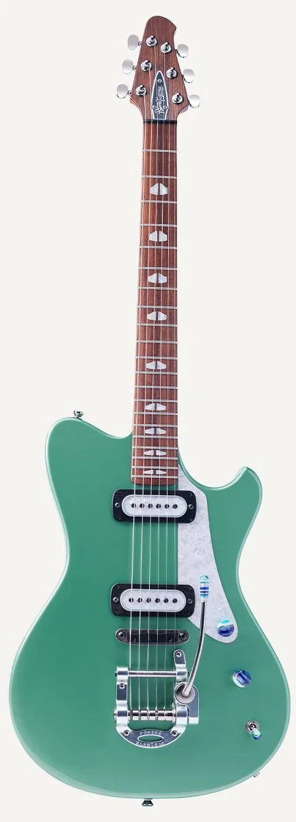
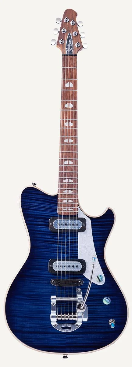
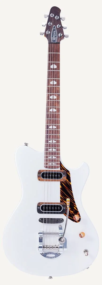
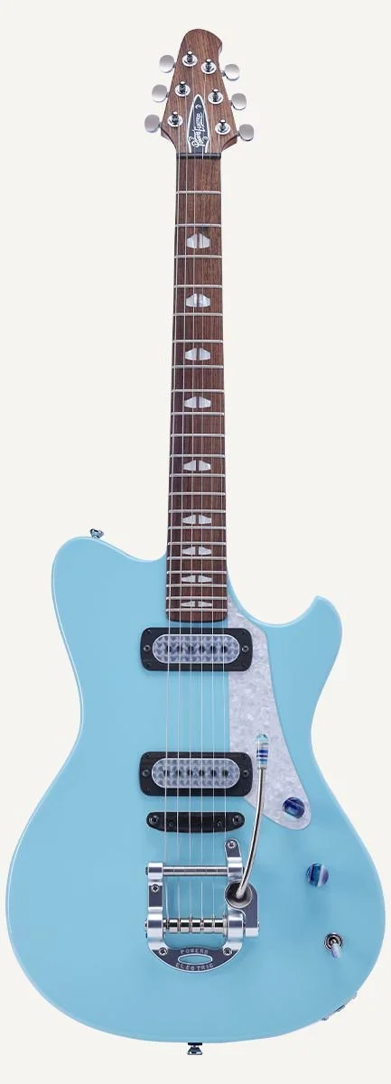
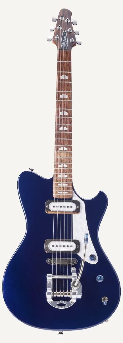
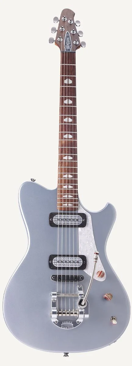
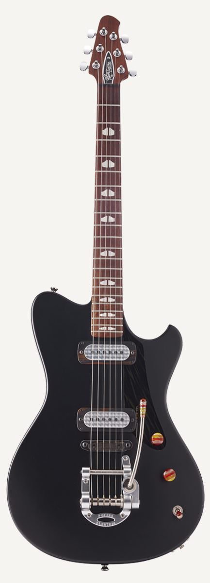
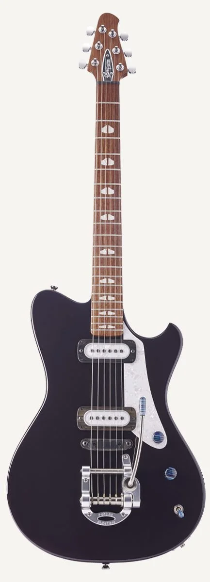
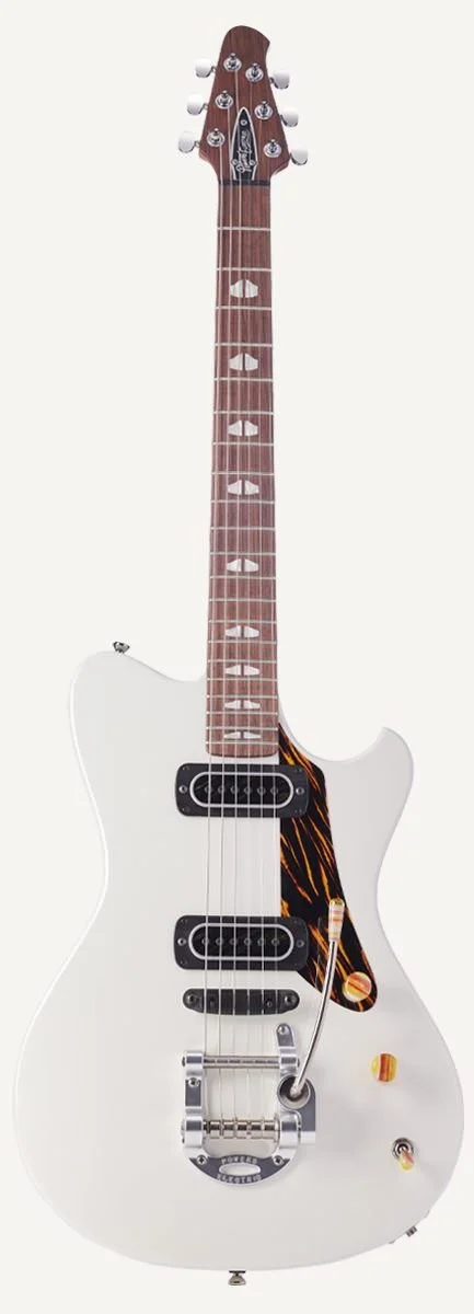
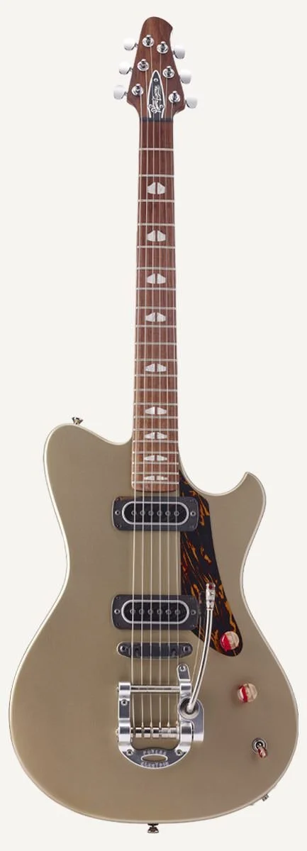
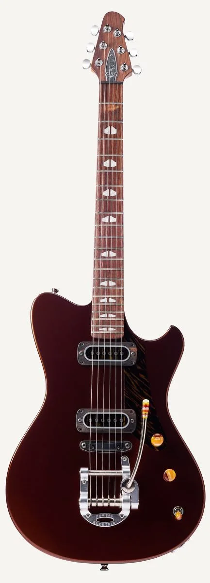
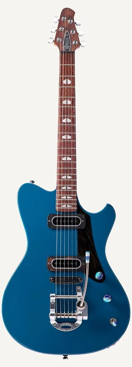
[What the look required on set: lighting, surfaces, and how the grit was built in camera rather than added in post.]
Powers Electric and Circa74 were built from zero in the same window to deliberately opposite briefs: one gritty and loose, one warm and object-led. Running both at once is the clearest evidence here that I design identities rather than impose a style.